Brand Identity and Core Values
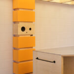
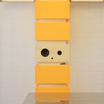
The House of B Store, designed by Another D Studio, encapsulates the essence of the Workerbee brand. This project aims to enhance and deepen the brand’s identity, which was initially conveyed through its products and services. Workerbee, known for its regionally produced honey, communicates its core messages through its mascot, Kerbee. Although Kerbee doesn’t exist physically, it brings the brand’s messages—”Save the Bees” and “Honey makes it better”—to life.
Reinventing Space: Mansion and Villa
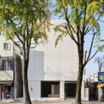
The project involved transforming two buildings, previously a hospital and a house, into the ‘House of B.’ Each building was designated a specific concept: ‘MANSION’ and ‘VILLA.’ By implementing these concepts, the brand’s story is shared with the public through physical spaces.
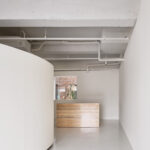
Expanding the Brand Image: The Mansion
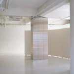
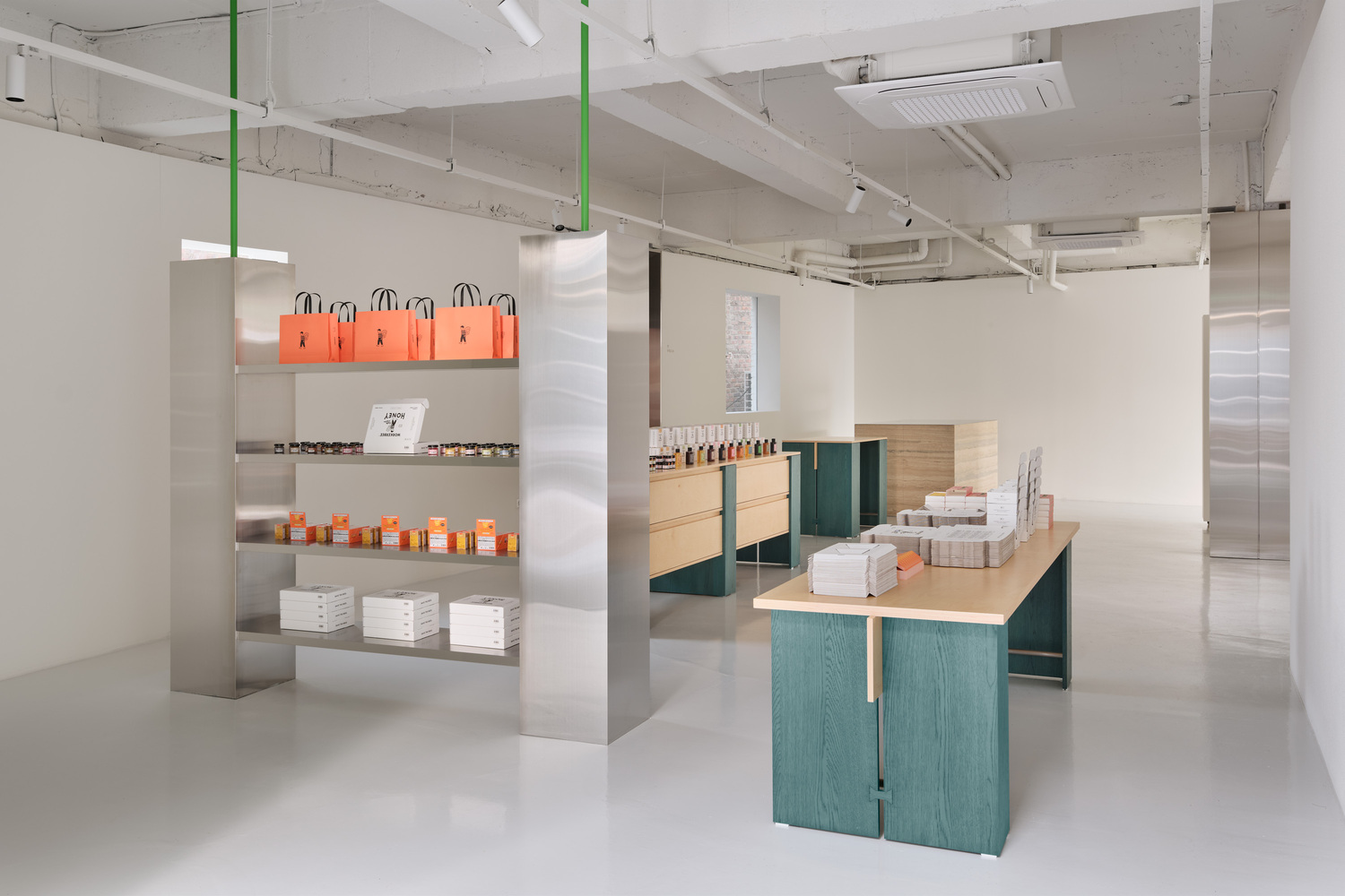
The Mansion, a three-story building once used as a hospital, showcases the potential for expanding Workerbee’s brand through modern spatial design. The structure, featuring red and natural wood elements, stands out in a clean and minimalist space. This design elegantly represents the brand’s existing colors, creating a sophisticated yet powerful appearance. The Mansion acts as a blank canvas, illustrating the endless possibilities for the brand’s growth and direction.
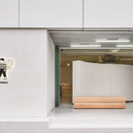
Bringing the Brand to Life: The Villa
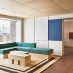
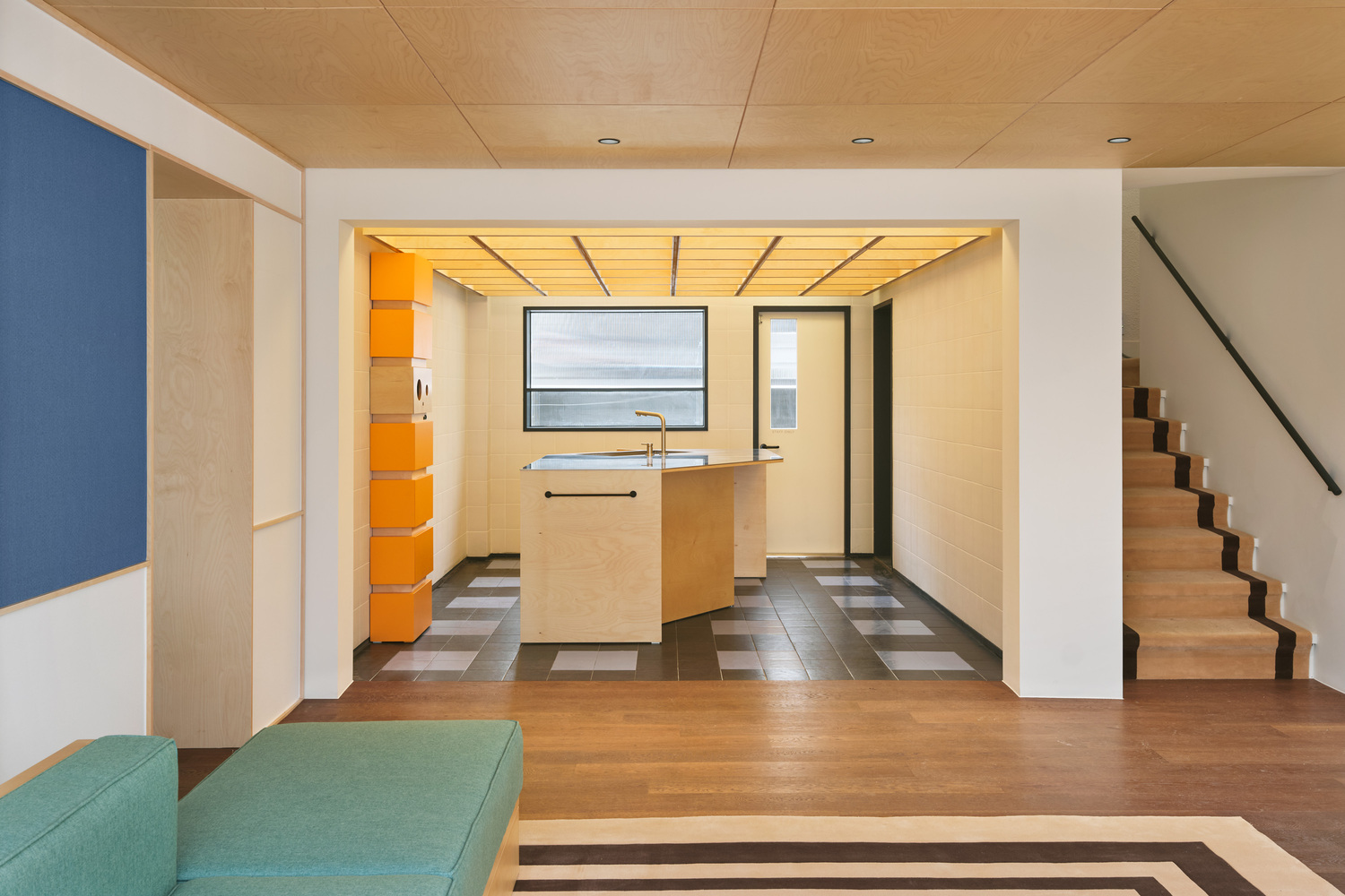
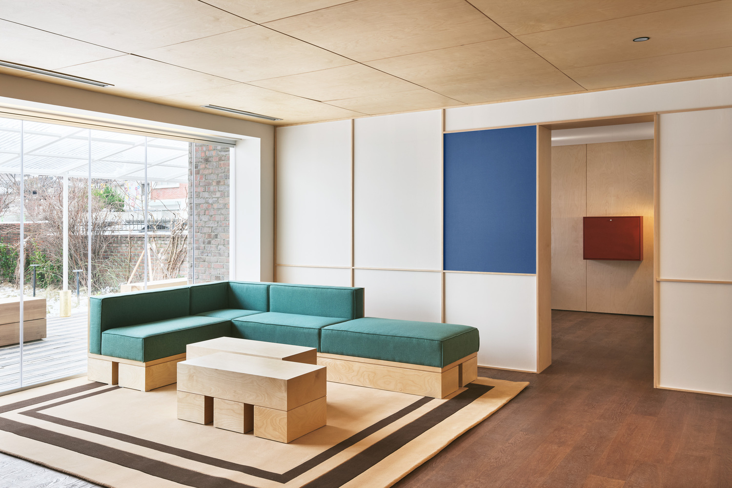
The Villa, formerly an old house behind the hospital, is reimagined as the home of Kerbee. The design process centered around the persona of Kerbee, asking, “What would Kerbee do?” at each step. Upon entering the Villa, visitors are greeted with a warm and inviting atmosphere. Features such as dark wood flooring, patterned tiles, and brick elements evoke Kerbee’s presence and taste. The garden, designed to offer a sense of countryside tranquility, provides visitors with a brief respite from urban life.
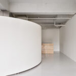
Creating a Unified Space
Although the Mansion and Villa are separate buildings, a connected passage links them, and the backyard, which was previously intertwined with other structures, has been opened up. The space, initially divided both vertically and horizontally, has been transformed into a cohesive area with a singular movement line. This design unites the two buildings, organizing and deepening the Workerbee brand’s colors and creating a space that effectively tells the brand’s story.